When I first read this review in the New York Times last year, I said to myself, “Maybe, just perhaps I should go to London, it sounds like a pretty kick-ass exhibit.” But then life got in the way, I put the idea on the back burner and almost forgot about it.
But everything works, if you let it. And it wasn’t but a couple of months later that I discovered that the exhibit, Diaghilev and the Golden Age of the Ballets Russes 1900-1929 was going to be in Quebec City this summer. Sweet! While it is only a five hour plane ride from Montreal to London, it is only a three hour car ride from Montreal to Quebec City. Or in other words 40% shorter, and there’s room to stretch, and the food is better.
One problem, while I don’t know how to fly, buying a plane ticket isn’t too complicated. But as I also don’t know how to drive, trying to find a sucker someone extremely kind, nice and generous who would drive me and my sorry ass down river so I could see a bunch of ballet costumes that were almost a hundred years old did almost prove to be an insurmountable obstacle.
In the interim this review came out in Le Devoir (unfortunately behind a paywall) where Catherine Lalonde wrote « Demeure donc une impression de rendez-vous manqué. » Or if you prefer, “One gets a sense of missed opportunity.” Which almost put a kibosh on my desires. But thankfully I am pigheaded, persistent, and kinda realize that my cultural connections are much more aligned with the New York Times than they are with Le Devoir. So on August 29, I got chauffeured down the 20, and boy am I glad I got so lucky.
That’s one of the things I didn’t like about the Le Devoir review, given that a hard copy review has serious space limitations to use more than 30% of the word count explaining the historical background is a decision I’m not quite sure I understand.
Now that we’re all on the same page, what made it across the ocean is a slightly smaller and modified of the exhibit from the Victoria and Albert Museum called Diaghilev and the Golden Age of the Ballets Russes 1900-1929. Basically there was a whack of stuff added from the Bibliolthèque de la danse Vincent Warren and they cut some of the antecedents and maybe (my memory is a tad sketchy on this) some of the stuff that happened after he died. In Quebec there were nine sections in three galleries, in England there were (I think) two more sections, and I don’t know how many more galleries.
To cut to the chase, what got me were the costumes
Conception : Léon Bakst (1866-1924), costume d’une jeune grecque pour Narcisse, 1911, coton peint, v&a : s.610&a-1980 Costume for a Young Greek from Narcisse, by Léon Bakst. Cotton and paint. Photo courtesy Musée national des beaux-arts du Québec.
Now a) I’m used to seeing my ballet from the cheap seats and b) most of the dance performances that I see these days are not ballet. So being able to get this close to them and see them from all sides was surprisingly quite a thrill. The pictures don’t do them justice.
Léon Bakst (1866-1924), Costume de Mariuccia pour Les Femmes De Bonne Humeur, Années 1920, Satin et Appliques, V&A: S.148-1985 Léon Bakst, Costume for Mariuccia for Les Femmes De Bonne Humeur, 1920s , Satin and Appliques. Photo courtesy of Musée national des beaux-arts du Québec.
I was also fascinated by this piece of psychedelia, made more than 30 years before the invention of the word psychedelic.
Unfortunately, as I was initially planning on just enjoying the exhibit, and not writing about it, I didn’t take a single note, and as you can see am having to rely on pictures from other sources. However after going through the entire show I did ask a couple of questions of Jean-Pierre Labiau, curator of the exhibition, and he was quite gracious and generous with his time. I was also able to score one of the visitor’s booklets that they gave everyone, so I don’t quite sound so foolish.
They also gave everyone an audio guide, which only contained music. As M. Labiau pointed out there isn’t an awful lot of classical ballet in Quebec City and I guess that they wanted everyone to be able to hear the music that would have accompanied the performances. I was able to avoid the difficulties Ms. Lalonde had, by just saying “thanks, but no thanks,” and walking around the exhibit without headphones.
Also, I’m not sure if I was the one setting up the exhibit, that I would have done it thematically. Given how didactic it was (sorry about my consistent overuse and repetition of the word didactic, but I’m going through a phase. Not in this article specifically, but in life and in general I’m using it way too much).
I think, arranging it chronologically might have helped a bit, but no one thought to ask me. And then another thought that occurred to me on the ride back was that while being able to see the Picasso, Matisse and Braque designed costumes was pretty cool, artists today, or make that contemporary Quebecois artists who paint, don’t do work in textile.
I don’t know if this is a good thing – keeping your artistic output focused always helps in getting recognition – but it was kind of cool. It would be interesting to see someone like Adad Hannah, Rafael Lozano-Hemmer, Shary Boyle or Isabelle Hayeur design ballet (or theatre) costumes or more generally work with fabric.
And being able to see the sketches by Picasso, Matisse and Braque (and lots of others as well – heck I don’t think I have ever been that close to anything Coco Channel touched ever before (or will be ever again) in my life.
And this too was interesting, virtual reality before they invented computers, or make believe you were Diaghilev in your very own home.
And as this was my first visit to the Musée national des beaux-arts du Québec, it struck me as being much smaller than I imagined, at some point I’m going to have to try to sucker convince or bribe someone to go back.
And then finally if you want to read someone else who is much more eloquent than I am on the exhibit, you should take a gander at Andrew O’Hagan’s review from the Guardian.
One of my favorite Montreal sculptures is Comme si le temps… de la rue by Pierre Granche. Unfortunately, in the most recent set of renovations to what used to be the Hall des Pas perdus of Place des Arts, but that they now call Espace culturel Georges-Émile-Lapalme they have just about killed it.
Comme si le temps... de la rue by Pierre Granche
A little background; back in the early 90’s the Musée d’art contemporain de Montréal was planning on moving from Cité du Havre to downtown and getting themselves a brand spanking new building in the process. As the law stipulated, 1% of the project had to be dedicated to creating art. Even if it was a museum they still had to make more art specifically for the place (that’s one of the things I like most in theory about the 1% for art law, is that it ends up creating site specific work).
Anyhows, Pierre Granche [pdf alert] a sculptor and a teacher (he was one of the people responsible for the Universite de Montreal‘s visual arts department – and now that he’s dead, they no longer have one. Make of that what you will…) submitted a proposal and won. (I’m still going to have to try and find out who was one the jury.) And in 1992, what ended up getting built was Comme si le temps… de la rue.
The view from the bar of Comme si le temps... de la rue by Pierre Granche
Basically it was a bunch of aluminum cutouts in a semi circle with a waterfall. It was open to the sky and viewable from the esplanade of Place des Arts, which gave a viewer the chance to have a complete overview of the entire piece (which is not a small piece by any stretch of the imagination). And there is a skylight looking down into the Musée d’art contemporain de Montréal’s restoration workshops.
I never gave it much thought, always figuring that at some time in the future I would hunker down and give it the time, energy and thought that it required.
Well that time is now (actually, Sunday night, as I try to write these posts in advance of posting them). Because I was passing by over the weekend and from where I sit the powers that be (in reality Consortium Menkès, Schooner, Dagenais, Le Tourneux/Provencher, Roy Jean-Pierre Le Tourneux, concepteur Claude Bourbeau, chargé de projet) have completely and thoroughly killed, destroyed, ruined and entirely screwed up Comme si le temps… de la rue [pdf alert] by Pierre Granche.
In short, by placing a roof over it and turning off the waterfall, they have stripped the sculpture of all meaning, significance and comprehensibility. it is now no more than the equivalent of a fancy-ass and extremely expensive indoor lawn ornament for the Deschamps bar at Place des Arts.
Another view from the bar of Comme si le temps... de la rue by Pierre Granche
From the seats at the the Deschamps bar, it is completely and thoroughly impossible to get any perspective on the piece. By being so close to it, you literally can’t see the forest for the trees.
The third view from the bar of Comme si le temps... de la rue by Pierre Granche
The roof of the bar prevents you from seeing the tops of the sculptures. And by being so close you can no longer gain any perspective on the base. And perspective was what Comme si le temps… de la rue was all about. There are two extremely large and two merely large aluminum sculptures that depending on which way you swing could represent either the ancient Egyptian god Sobek, or the ancient Egyptian god Set. There are also a couple of construction cranes, and seven things, that again (depending on which way you swing) could either be some sort of vaguely sphinx-like objects, or if you squint really heard could be viewed as some kind of deer or reindeer-like domesticated animal.
The plaque for Comme si le temps... de la rue by Pierre Granche
My quick and dirty translation of the plaque for the blokes in the house
Pierre Granche’s installation offers a mythical vision of Montreal. Inspired from Greek Theatre and Egyptian iconography, it works a representation of the urban fabric between Mount Royal and the St. Lawrence River through the use of a waterfall. Sculptured female figures used as a columns in an Egyptian style with bird’s heads refer to the history of art and architecture in a totem pole fashion. The sphinxes with deer antlers make their presence known on the outskirts of a city in action. And finally, the bird’s eye view of the work was from the esplanade of Place des Arts Preview, reflects the city as the top of Mont Royal.
OK, how many mistakes can you spot? If I were a tourist wandering through Espace culturel Georges-Émile-Lapalme I’d be scratching my head in wonder, trying to figure out what the heck they were talking about. Waterfall? Bird’s eye view? There ain’t none, no more.
And while I’m at it, there isn’t any Greekness (theatre or iconography or anything else) in the piece. When they are writing in French they use the word cariatides or in squarehead speak: caryatid, or in plain English “a sculpted female figure serving as an architectural support taking the place of a column or a pillar supporting moldings and bands on her head.” (Thanks Wikipedia!) And they speak of it as the parts that are Greek. One problem though, a column by definition supports something. And these objects don’t support a darn thing. Comme si le temps… de la rue is 100% Egyptian in its influences.
A slightly different interior view of Comme si le temps... de la rue by Pierre Granche
And as long as I am disputing the “official” wall plaque. Those aren’t deer antlers on the sphinxes either. I don’t think that there ever was a 37 point buck that ever lived… anywhere.
One of the sphinx-like objects in Comme si le temps... de la rue by Pierre Granche.
However, if you go with the idea that the two extremely large and the two merely large sculptures are representations of the Egyptian god Set, the god of chaos and foreign lands. Then I think we’re getting someplace. The early 1990s in Quebec were a volatile place. Quebec was on the cusp of a referendum to separate, the Bloc Quebecois were founded in 1991. In between 1990 and 1993 there were 46 major buildings built in Montreal. The Montreal Expos were sold in 1991 and subsequently became one of the best teams in major league baseball in the early 1990s. 1992 was also the 375th anniversary of the founding of Montreal. There were a ton of things happening in Montreal at the time and there was most definitely a sense of chaos in the air (if you don’t trust me, ask someone else who lived here then).
Interior view of Comme si le temps... de la rue by Pierre Granche
Also if you look closely, on each of the Sets, there is a cityscape, with some sort of root structure. I’m not quite certain what to make of the root structures. But if you flip them upside down, they become the deer antlers on the sphinxes. And there are no known instances of deer appearing in ancient Egypt. But maybe, kind of, perhaps it has something to do with some sort of family tree-like structure? I dunno.
But we’re getting off the point here. Comme si le temps… de la rue is all about Montreal. There’s a representation of the mountain on the largest Set, and the waterfall was a direct reference to the river.
Detail of Comme si le temps... de la rue by Pierre Granche showing the mountain on Set's head.Detail of Comme si le temps... de la rue by Pierre Granche showing the (now dry) waterfallDetail of Comme si le temps... de la rue by Pierre Granche showing the drain
And while we’re showing lots of pictures, here are some of it from above.
As you approach to view of Comme si le temps... de la rue by Pierre GrancheA horrible view of Comme si le temps... de la rue by Pierre GrancheStill another horrible view of Comme si le temps... de la rue by Pierre Granche
And then in consideration of the unilingual people in the house, Comme si le temps… de la rue translates as “As if time… from the street.” You can fill in the blank yourself, but by referring back to ancient Egyptian times Granche endows Montreal with a similar sense of history. Despite it being made when Montreal was only 350 years-old, if you squint hard enough (or maybe click your heels three times or go to the Neighborhood of Make-Believe) you can pretend that Montreal has been around for more than 5,000 years, just like Egypt.
Then my last question is, if it was made for the construction of the Musée d’art contemporain de Montréal and is directly on top of their restoration workshops, why does it belong to the Place des Arts collection? Shouldn’t it belong to the Musée d’art contemporain de Montréal?
What is it about Montreal and place temporary sculpture exhibits in parks where junkies hang out? Last month I wrote about Robert Lorrain at the Parc des Faubourgs, and at about the same time as I was writing that, I discovered the Glen Le Mesurier exhibit called Arcane de Mer at Cabot Square.
Cabot Square, for those who don’t frequent it all that often, is across the street from the Pepsi Forum and is notorious for being a hangout for junkies, hookers, hustlers and other assorted members of the not-quite-ready-for-the-nine-to-five lifestyle. I, myself, can remember selling oregano cigarettes, 3 for $5 there before a Gentle Giant show there in the 1970s.
The Pedagogic Panel for Glen Le Mesurier's Arcane de Mer.
Yeah, I know it’s not a great photo, but if you squint you can make out what it says. For the francophobes reading this, it roughly translates as
Glen Le Mesurier is a prolific artist know for making environmental sculptures. For 25 years he has show his work in Europe and the United States. In Montreal his work is on display at Sunset Garden [Ed note: it sounds WAY better in French as Le Jardin du Crépuscule] a permanent exhibit in the hipster neighborhood, Mile End. There are over 100 of his sculptures all over the world, Montreal and even in some private homes and stores. This exhibit of 10 sculptures made out of steel recycled from trains and ships took over two years to make. In memory of the voyages that Cabot made. These sculptures form an allegorical triptych combining movement, shipbuilding and spirit of adventure.
Overall it’s a nice enough exhibit. I didn’t get (or see) and of the kineticism of the sculptures, nor did any of them remind me of shipbuilding or Giovanni Cabot. But maybe whomever wrote the offending paragraph on the sign didn’t actually have a chance to see the sculptures before writing what they wrote.
A sculpture by Glen Le Mesurier in Arcane de mer at Cabot Square.
As none of the sculptures had titles (or had titles that I was able to ascertain) it’s tough to figure out what M. Le Mesurier had in mind. If you squint hard, this one can look like a ships wheel. But to my eye it looks way more like an eye or perhaps a compass. Then again, it also could be some sort of monument to a sun god or any number of other things depending on which way you look at it.
A sculpture by Glen Le Mesurier in Arcane de mer at Cabot Square.
This one, I’m not certain what to make of it, a bunch of circles, and semicircles, arranged in a vaguely totemic fashion. It doesn’t make me think much about the sea or ships unless I squint hard and then perhaps, maybe it reminds me of something kind of like a lighthouse. But if M. Le Mesurier had decided to name the exhibit Arcane de Haida then the connection to totem poles would be much more evident. And what’s with the use of the word “Arcane” in the title? On one hand, if he wanted to keep things mysterious, secret and obscure, I would have suggested picking a title that didn’t attract attention to the mysterious, the secret and the obscure. But on the other hand, I can’t help but think that the title has something to do with Tarot cards, but there are only 10 sculptures, whereas there are 22 arcana major cards and 56 arcana minor cards so the numerology is not quite there.
A sculpture by Glen Le Mesurier in Arcane de mer at Cabot Square.
I don’t quite know what to make of this one, especially since it has a hat on. The gears inside kind of confuse me as well. Up close it reminds me of a film projector. But I have a sinking suspicion, that I’m missing something.
Close up of a sculpture by Glen Le Mesurier in Arcane de mer at Cabot Square.A sculpture by Glen Le Mesurier in Arcane de mer at Cabot Square.
This sculpture, appeared to me, to be placed in the wrong direction. It’s on the northwest side of Cabot Square, facing Lambert Closse. Which is all fine and dandy if you want the buses to be able to see what it looks like from the front. Because they are the only things on Lambert Closse. If whomever had installed it, had twisted it 180 degrees, then the denizens of the square would have been able to see it from the front.
A sculpture by Glen Le Mesurier in Arcane de mer at Cabot Square.
No matter how hard I try the only thing I can think of when I see this sculpture, is Fozzie Bear. I think it has to do with what I would call “the mouth.”
Close up of a sculpture by Glen Le Mesurier in Arcane de mer at Cabot Square.
A sculpture by Glen Le Mesurier in Arcane de mer at Cabot Square.
At which point it probably would be better to start talking about form. If you notice, three of the five sculptures so far are columns with a circular piece on top, frequently the circular piece on top has some sort of mass inside. For those that aren’t made to look like magnifying glasses, M. Le Mesurier still manages to work a lot of circular parts in and on to the sculptures.
Now other than Cabot being fairly instrumental in proving that the world was round, I don’t see any other connections between the sculptures themselves and “Arcane de Mer.” And the world being round isn’t exactly the most obscure fact around.
Close up of a sculpture by Glen Le Mesurier in Arcane de mer at Cabot Square.
What’s not to like about really big rusted chains?
A sculpture by Glen Le Mesurier in Arcane de mer at Cabot Square.A sculpture by Glen Le Mesurier in Arcane de mer at Cabot Square.
Front and back views of what I think is my favorite sculpture in the exhibit. I don’t know if it is because there is text on the metal, or because he is using an I-beam for a pedestal, or if it is due to the reproduction of the Roman aqueducts being stuck on the front, or something entirely different.
In a nutshell, with this piece M. Le Mesurier has exploded his normal methodology. Instead of having a circular piece with something insde it on top of a column, he has taken the guts (the stuff that would normally be inside the circle) and placed multiple circles around it (and also depending on your perspective, in it and on it). In effect exploding his typical style.
As a consequence, where the sculptures that look like a magnifying glass kind of focus your view on one spot, your eye ends up roaming all over the place on this one.
A sculpture by Glen Le Mesurier in Arcane de mer at Cabot Square.
The only thing that comes to mind upon seeing this one, is Etta James’ song Tell Mama.
“…and I’ll make everything alright.” Granted there are no legs, and the sculpture isn’t quite as voluptuous as Etta James is, but those arms look extremely inviting and comforting. It might have something to do with the lack of detail in the face, and as a result you end up imposing your own ideas on it, and mine say “Etta James.”
A sculpture by Glen Le Mesurier in Arcane de mer at Cabot Square.A sculpture by Glen Le Mesurier in Arcane de mer at Cabot Square.
The last two sculptures at Cabot Square. I find them kind of “meh” but you may think differently.
Overall, it’s nice to see that the city takes the initiative to install temporary sculpture exhibits in disadvantaged neighborhoods during the summer. And Glen Le Mesurier’s work is a far sight better than that by Robert Lorrain at the Parc des Faubourgs, but M. Le Mesurier still has a long ways to go if these works are examples of his latest work. These sculptures are far too similar, bordering on clichéd, the only thing that they have going for them is their massive nature, but after a while, even extremely large gets mundane.
Other than making the presumption that M. Le Mesurier used old bits of ships to create the works, I can see no connection to the sea (even an obscure one) and with a lack of titles trying to find a quote, deeper, unquote meaning is going to take just a little bit more time than I have to invest in M. Le Mesurier’s work.
Ultimately I just wish that the city would be able to install a better caliber of work in both Cabot Square and Parc des Faubourgs.
While I was at the Eaton Centre the other day I wandered up to the top floor and came across an exhibit of children’s pictures.
Some drawings by children on the top floor of the Eaton CentreSome more drawings by children on the top floor of the Eaton Centre.
On the flip side were portraits of (what I presume are) the children who did the drawings.
Portraits of children on the top floor of the Eaton Centre.
And dispersed around were some wall panels that explained things.
Wall panel explaining what the exhibit is about.Wall panel explaining that the Quebec government gave money so that this exhibit could happen.
And this is where my gums start flapping and I get a little bit agitated (it’s ok, I’ve had my blood pressure tested recently, and it’s ok). Ostensibly this is an exhibit of children’s self-portraits from around the world. And in going through it, it appeared that most of the children were from some pretty poor places. Or more bluntly there weren’t any pictures by middle-class children.
Some more children from the exhibit.
Which got me wondering how much money each of the children got for participating in the project, and how much money Gilles Porte got to travel the world to gather the self-portraits by disadvantaged youth around the world and then print them in a large scale format.
Heck it got me thinking how this must be one of the more effective uses of money by the Quebec government to raise awareness of the basic rights of children around the world, because there was not a single person on the entire floor while I went around taking photos.
And since they were trumpeting how the exhibit had been to 20 other French cities as well, I wondered if they had placed it in other places that got little to no traffic.
And then the thing that really got my bile flowing was this juxtaposition:
One of the portraits next to an advertisement for The Gap.
Now I realize you can’t really make out the portrait of Penda too easily, but see that Gap ad right next to it? Now please explain the difference between the two to me (other than the fact that they are of two very different children).
So as far as I can tell (please someone tell me that I’m wrong) the Quebec government spent good money on an photo exhibit in a mall that is being seen by no one and that is for the most part indistinguishable from advertisements.
Imagine if you will a piece of art that is ignored by approximately 150,000 people ever year. And a pretty gosh darn spectacular piece of art at that… Such is the predicament of Micheline Beauchemin‘s Rideau de lumière, couleur du temps (1967). I guess that there are approximately 750 seats in Théâtre Maisonneuve at Place des Arts, and that it has some sort of performance about 200 nights every year. Therefore if my guesses are right, 150,000 people pass by it each and every year. (Although, before you go quoting me, be aware, I am horrible at guessing things and I have been wrong before, and most definitely will be wrong again).
The Plaque for Micheline Beauchemin’s Rideau de lumière, couleur du temps (1967)
As the plaque says:
Curtain of Light, Color of the Times (1967). 300,000 pieces of acrylic mounted on stainless steel wires. 305 feet by 25 feet. Collection Place des Arts, restored in 2000.
And I presume it was all made by hand. Because back in those days they had just graduated from inventing fire and the wheel, and no one had figured out how to invent technology, yet.
But one of the weirdest things is watching how just about everyone before a performance at Théâtre Maisonneuve and during intermission pretty much ignores it. While the drinks they serve at the bar during intermission might be cold and delicious, or the desire to get that front row centre seat might be overwhelming for those that arrive early, flat out ignoring Micheline Beauchemin’s Rideau de lumière, couleur du temps (1967) just ends up making someone look like a mouth breather.
As I mentioned, it is made out of pieces of acrylic and stainless steel wires. The pieces of acrylic appear to be extruded in a variety of different shapes; triangular, diamond, pentagonal, and something looking like a vaguely irregular cylinder. Each one is about one inch in length (the metric system hadn’t been invented then, either) and has about a one inch gap separating it from the piece above and about another one inch gap separating it from the one below. Each thread is spaced about two inches from the ones adjacent. The acrylic pieces are suspended on stainless steel spacers that have been crimped onto the wires. These spacers are used as stoppers to prevent the pieces of acrylic from falling, by means of a conical hole drilled into the center of each piece of acrylic. And finally, each wire has a plumb at the bottom so that it hangs straight.
Installation view of Micheline Beauchemin’s Rideau de lumière, couleur du temps (1967)
In the picture above you can see the spacers, notice as well, the regular distribution of the acrylic pieces both horizontally and vertically. Although surprisingly, I was not able to figure out, nor see any pattern made using the shapes of the pieces of acrylic. But then again wrapping my head and eyes around 300,000 pieces of extruded acrylic is not something I try and do every day. When viewed head on, the curtain appears for the most part translucent, because your eyes naturally focus on what is beyond the curtain and window it is hung in front of – the plaza of Place des Arts, and now (unfortunately) the behemoth that has become the Quartier des Spectacles. However, when viewed on an angle it quickly becomes opaque, due to the fact that your eyes will naturally focus on the pieces of acrylic.
Installation view of Micheline Beauchemin\’s Rideau de lumière, couleur du temps (1967)
Micheline Beauchemin was born in Longueuil in 1929 and died in Les Grondines in 2009 about a month short of her 80th birthday. In between those dates she packed an amazing amount of travel, work and awards into her life. Initially trained as a painter and in stained glass at the Montreal School of Fine Arts, the École des beaux-arts in Paris and the Académie de la Grande Chaumière in Paris. She began making tapestries in the early 1950s, and first exhibited her tapestries in 1956 in France. In about 1963 she hit her stride, and by 1968 was making monumental tapestries like this one. (If you would like more details about her life, I snagged some useful information from these websites, one, two, three, and I’m certain that if you dig a little deeper, you can find lots more).
Installation view of Micheline Beauchemin\’s Rideau de lumière, couleur du temps (1967)
There is an awful lot that can be read into Rideau de lumière, couleur du temps (1967) starting with the materials used; while it is called Curtain of Light, Color of the Times the curtain itself doesn’t give off any light, but it does both reflect the light and let the light through. As mentioned above, the curtain becomes opaque, and starts reflecting light when you view it on an angle, this is a purely physical reaction due to the spaces between each strand appearing smaller and smaller. Because it reflects the light when viewed on an angle, depending on the lighting in front of the Curtain of Light, Color of the Times it can appear warm or cold, and it can have a muted glow or a bright and hard shine. In fact it is incredibly chameleon-like. This characteristic is especially evident when it is viewed head on. When viewed head on, the spaces between each strand are large enough that your eyes naturally focus on what is behind the curtain, in effect making the curtain not only transparent but in certain cases, invisible.
Installation view of Micheline Beauchemin\’s Rideau de lumière, couleur du temps (1967)
Made at the height of the 60s, and at the time when Montreal appeared to be the absolute best-est place in the entire known universe to live, Rideau de lumière, couleur du temps (1967) absolutely and completely lives up to and beyond its name. As a curtain of light, it is a spectacular example, reflecting and glittering gently, in the background unobtrusively doing its business – hence why so many people ignore it – working as a barrier between the inside and the outside. It also serves as a very hippy take on marquee lights, and can also be interpreted as a way of reflecting and thereby reminding the audience of what happens (or has happened) in Théâtre Maisonneuve. And as it is also transparent and see-through, it thoroughly can be understood as a color of the times – or more bluntly, you can see through it to see what is happening now, what is coloring and shading reality.
Outstanding in just about every respect, Micheline Beauchemin’s Rideau de lumière, couleur du temps (1967) is a monumental tapestry that works well on very many levels. From the purely aesthetic, to the highly theoretical and abstract. Suitable as a discreet background for a public room and as an object in its own right that commands 100% of your attention, it shows off many of Micheline Beauchemin’s ideas and concepts while at the same time spotlighting her skill and mastery as an artist.
Lifting directly from Wikipedia: William Holman Hunt was an English painter, and one of the founders of the Pre-Raphaelite Brotherhood. Oooopsie! Sorry about that, I was looking for a translation of Tableaux de chasse, the name of the exhibition by Diane Dubeau at the Maison de la Culture Frontenac, and “Paintings of Hunt” was one of the possibilities. Actually “hunting paintings,” works better but still isn’t perfect, and since Ms. Dubeau has a lot more than just paintings in her exhibit, I imagine that the title is far from perfect in French. So an imperfect translation is what I’ll go with. And imperfection seems to be the overarching theme to the show. There are good pieces (Famille de Lapins)
Famille de Lapins by Diane Dubeau
there are bad pieces (Alambic de Creation)
Alambic de Creation by Diane Dubeau, photo by Paul Litherland
and there are pieces that made me scratch my head (a bunch of others). Then if you combine that with the bureaucratic boondoggle I had to traverse in order to get some pictures, imperfection and head scratching are the only things that I remember from the exhibit.
But let’s back up a little bit – I have no idea who is the person responsible for getting exhibits into the Maison de la Culture Frontenac (there are certain advantages, or disadvantages, about a faceless bureaucracy, I guess) but for the most part they do a very good job of putting on exhibits, better than most of the other Maison de la Cultures, in fact. The only complaint I would make is that they tend to rely too heavily on quote, dramatic lighting, unquote, which can get a tad tedious after a while. But hey! Whatever turns your crank. Anyhows I was down there last week (see the review of the Arlette Vermeiren Zucoli exhibit there that I published last week) kind just looking around, minding my own business when this teenager pops in, looks at one wall, then at me and then leaves. I don’t pay it no mind, and continue trying to wrap my head around Ms. Dubeau’s works – figuring for the most part that despite whatever good is attempted by bringing art to the people, by placing art in their neighborhoods, you still can’t get over the fact that most people still only want to spend about 15 seconds in front of a piece of art (fact!).
To be honest, I made that last statistic up. Even I’m not certain if I should believe my parenthetical statements. So you should be extremely careful when reading them as well. However, as I was just about done, the very same teenager comes back into the room and tells me I can’t take pictures. Now, I had no desire to get into an argument, and to be honest I was just taking snaps more for note-taking purposes than for actual “I’m-going-to-print-these-pictures-up-and-makes-scads-of-money-off-of-Ms.-Dubeau’s-work” purposes. But it was enlightening to see that said teenager wasn’t a disinterested teenager, and in fact was a teenager with a summer job working at an art gallery.
But back to Ms. Dubeau’s exhibit… it’s obvious from the title that she’s aiming for a quote, Big, unquote statement. Off the top of my head, maybe something having to do with how we eat, what we eat, societal norms while eating, and that’s even before reading the press release or giving PETA’s agenda half-a-thought. I’m certain that if you furrowed your brow for 30 seconds you could come up with half-a-dozen more.
Let’s start with the first pieces you see upon poking your nose down in the basement of the Maison de la Culture Frontenac. I kind of think of them as a triptych, but I have a feeling in the pit of my stomach that they are three separate paintings hung together because someone at the Maison de la Culture thought it would be Dramatic! (with a capital “D” and an exclamation point!). Called Cible I, Cible II and Cible III, L’Ours, Le Raton [sic] and La Femme au Bois respectively. Or if you prefer, Target 1, 2 and 3. The Bear, The Raccoon (actually there is no such animal in the French language as a “raton,” but a raccoon is called a “Raton laveur,” which should be close enough, but we could potentially get way off the rails if I mention that “raton” is a racist term for a North African, so I won’t. OK?) and the Woman in the Wood in my bestest bloke translation.
Cible I, Cible II and Cible III, L'Ours, Le Raton (sic) and La Femme au Bois by Diane Dubeau
As you might expect they are acrylic paintings of a bear, raccoon and a woman – although contrary to most western traditions they go right-to-left (like Arabic), not left-to-right. The bear has a red and black plaid swatch over where you would imagine its heart to be. The raccoon is wearing a Coonskin hat, and the woman a ridiculous pair of 15-point antlers. Ridiculous because 15-point antlers are “rarer than a can of dandelion and burdock.” They are large paintings, although only the raccoon is larger than life. Done on some sort of rough planking. Given the titles and the collage-like nature I imagine one is supposed to look for the quote, deeper meaning, unquote, but beyond the cartoon nature of the images, I got nothing. Am I supposed to think that because the bear has a red and black swatch of plaid on its chest and the raccoon is wearing a hat that there is some sort of inherent similarity between animals and human beings? Because the woman has antlers that she is as much of a trophy as a deer is? I think not. They are hung in a staggered fashion, transversely to the walls, parallel to the entry, which as you might expect is in one corner or the room, and very brightly lit, making them initially appear like some sort of vedette on a stage. Say, Bianca Gervais in Nitro.
Moving counter-clockwise through the room, there is an installation of some sort. Called Ossuaire (again mistitled, as an ossuary is for human bones, not those of animals) it is made of “Bones, 462 T-pins, and Vinyl Letters.” The letters spell out les restes des animaux que j’ai manges, depuis janvier 2010. Or for the blokes in the house, the remains of the animals I ate since January 2010. Now first off, if she’s counting the pins, why not count the bones? For the curious in the house, there are 213 by my count. And while I’m not certain that I would call the Maison de la Culture Frontenac a valley, but those dry bones were like a clarion call to me. I was extremely careful as to what I said around them, lest they all rise up and become a bunch of Zionists.
Ossuaire by Diane Dubeau
Second, if it’s all the animals she’s eaten since the beginning of 2010, then where are the recent additions? The exhibit has been up since June 23rd, I saw it in July and it stays up until the end of August, but it doesn’t appear that there are any new additions, which either means that Ms. Dubeau has stopped eating meat with bones for the duration of the exhibit, or something else. (And speaking of vegetarianism, I don’t know if I dreamed it, or if I saw it, but I distinctly have a very vivid memory of seeing Ms. Dubeau saying that she was a vegetarian, but I can’t find it for the life of me, hence why I put this in parenthesis. In what passes for a lobby at the Maison de la Culture there is a video interview playing, and a little voice inside my head tells me I saw it there. But on the internet the video makes no mention of Ms. Dubeau’s eating habits.)
And speaking of the video, remind me never ever to hire whomever made it. A) The sound recording is horrible. B) for such a short film, the amount of “umms,” “ahhs” and other non-words that were left in is atrocious. Although I didn’t time it, I would guess of the 84 seconds, 15 seconds – or almost 20% – is nonsense noises of Ms. Dubeau thinking. But the thing that almost made me fall off my chair in amazement was that the credits are 46 seconds long on a video that is 84 seconds long. Or 55% of the length. I can’t understand how something so short, needs to have credits that are so long. Actually I can, and it involves ego, or at least the only reason I can imagine needing credits that last so long is so that everyone (all 43 viewers as of this writing) can read who was responsible for making the video, and if that’s my tax dollars hard at work (thee different levels of government funded it) I sure as shooting would prefer that the cash go to the artist than to the folk who made the video, but I digress.
Back to the art; the next thing on the wall is called Camouflage Armé. Initially I was nonplussed by this painting. It’s kinid of boring, what with all the camouflage, and it’s kind of difficult to see the paper-maché skull in it – but then upon a closer examination, I noticed the knitted bullets framing the piece and completely and utterly fell in love with it. I’m a sucker for fiber art…
Camouflage Armé by Diane Dubeau
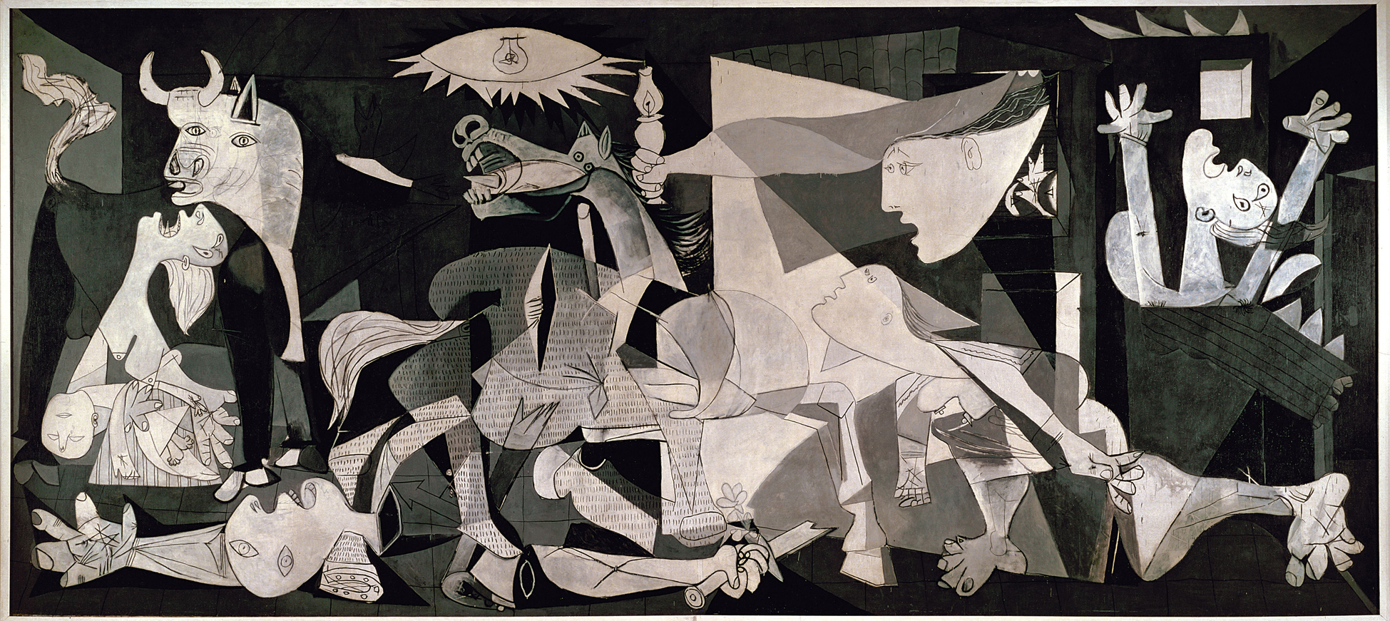
Next on the wall (actually more like in the corner) is the Famille des Lapins, or for those of you challenged by the second language, The Rabbit Family. On a shelf, a toy-stuffed bunny pinned to the shelf, a framed picture of a bloody rabbit skull, a jar of rabbit skulls in a liquid filled jar along, blue rubber gloves pinned to the shelf as well and a pair of tongs at a 45 degree angle leaned against the jar of skulls. Initially my reaction to this piece was the exact opposite of my reaction to Camouflage Armé. I was seduced by the ‘cool factor’ of the skulls in a jar – but upon further reflection it strikes me that this is a rather shallow piece. There’s no note that was inside any of the rabbits, and I’d be hard-pressed to see it as representing lust. Forcing an interpretation to go in only one direction (due to the graphic nature of the picture and the juxtaposition of the skulls in a jar). While there is good art that leaves nothing open to interpretation and basically sledgehammers you with its ideas and opinions (see: Picasso’s Guernica, Borduas’ Étoile noire or Rubens’ Saint George Battles the Dragon) for the most part I prefer art that is open to a variety of interpretations. It kind of gives you something to talk about, think and ponder, instead of being just what it is. And besides I like Hasenpfeffer and Coniglio All’ Ischitana.
Continuing on our tour around the room, Les Chasseurs (The Hunters) is very similar to Camouflage Armé in that it is a painting with most of the canvas covered by a camouflage pattern. In this case there are some fake rifle barrels on the frame and some cartoon-like images of 14 stereotypical hunters at the bottom, again a fairly straightforward painting. Not quite as forceful and in-your-face as Famille des Lapins, I think it could be made better by making the hunters larger and reducing the camouflage to background status. I also find it interesting that Ms. Dubeau decided to use quote, dramatic lighting, unquote for her camouflage paintings. The idea of shining a bright spotlight onto something that is designed to meld into the background is an interesting concept. I’m not certain if it was done intentionally as an awful lot of the exhibitions I’ve seen at the Maison de la Culture Frontenac used quote, dramatic lighting, unquote.
Les Chasseurs by Diane Dubeau
Ms. Dubeau appears to be intrigued by the number three. Or potentially thinks that triptychs are cool, because a bunch of her work is presented in threes. Case in point: Au Pays des Cauchemars,Au Cœur des Cauchemars and Le Trophée des Cauchemars. Three tiny assemblages (not quite paintings, not quite sculpture, not quite collage, not quite…) all made with acrylic paint, a toy moose, pins (although they look more like staples) and something she calls “perles synthétiques” but I would call plastic beads. I couldn’t quite figure out if they went right-to-left or left-to-right as none of them looked all that much like a trophy or a country. I wasn’t as confused by the heart one, but mainly because it was in the middle, not due to any of the iconography.
Au Pays des Cauchemars, Au Cœur des Cauchemars and Le Trophée des Cauchemars by Diane Dubeau
Her fascination with threes continues with La Chute I, II and III. The Rabbit, The Man and The Bird respectively. Either riffing off of Roberto Longo or Kate Puxley (or perhaps both, but then again maybe neither) This is how I think she should have done Les Chasseurs. Or more pointedly, a larger and more central image on a patterned background. Personally I’m not certain how I would interpret a falling rabbit, a falling bird sometimes can be considered a Stymphalian bird (from the sixth labor of Hercules) but that would be a humongous stretch in this case. And there is tons of fodder on and about falling men, if you need help click here. But I’m not quite sure what to make of the bones or the red and black checked backgrounds for the animals (aren’t picnic tablecloths typically red and white?) She also worked on the frames – but her pictures are too small for me to make out what she did to them, and as I previously mentioned I wasn’t allowed to take any pictures.
La Chute I, The Rabbit by Diane Dubeau, photo by Paul LitherlandLa Chute II, The Man by Diane Dubeau, photo by Paul LitherlandLa Chute III, The Bird by Diane Dubeau, photo by Paul Litherland
Next on the wall is Alambic de Creation. But as the cops say, “Nothing to see here, keep moving…”
Which brings us to Les Griffes I, II and III. Subtitled Fausses, Dégriffes, and Piercing (or in the words of squareheads, “fake, declawed and piercing.” I didn’t translate the word “griffes” because it can either mean fingernails, claws or a bunch of other things (including, interestingly, a cut of meat at the front of the shoulder) and my best guess would be that Ms. Dubeau is playing off of that double meaning in this work. Basically three plaster casts of a pair of hands, one would presume Ms. Dubeau’s hands, one pair with a fake set of very red nails, one pair broken off at the intermediate phalanges and the third pair which has those plastic beads (aka “perles synthétiques”) glued to them. What they have to do with hunting, I’m not entirely certain, but the bright red fake nails and plastic beads contrast quite well on the white plaster.
Les Griffes I, Fausses by Diane DubeauLes Griffes II, Dégriffes by Diane DubeauLes Griffes III, Piercing by Diane Dubeau
Tableaux de chasse,William Holman Hunt,hunting paintings whatever you want to call them ,the stuff exhibited by Diane Dubeau ain’t half bad. As a polemic about watching what you eat and how you eat it, it fails. PETA does this sort of stuff all the time – and while they aren’t a local Montreal artist – their tactics are much more effective. Then, if you listen to hunters who hunt to eat (aka folk like Ted Nugent) they are thousands of time more aware of environmental concerns, societal worries, social norms and just about anything else you can think of. As a means to quote, enlighten, unquote the general public about hunting and/or the source of their food Tableaux de chasse also fails, but not because of the content, but because of the container. I would guess that on a good day the Maison de la Culture Frontenac gets maybe 50 people coming in to see an exhibit. The show is up for 45 days, which means that if every day is a good day 2,250 people see the exhibit. Last I heard there were more than 3 million people living in Montreal, 2,250 isn’t even enough to be called a “drop in the bucket” if you’re talking about the general public. While Ted Nugent Spirit of the Wild might not be seen by as many people as the Super Bowl, but I’m fairly certain that more than 2,250 people watch it.
If I start to talk about the quality of Ms, Dubeau’s work there are obviously some pieces that are executed better (Famille des Lapins) than others (Alambic de Creation) and while the majority of the work in the show is painting the work that is most effective is surprisingly, not the paintings. Whether it is the frames with knitted bullets, the plaster cast hands, or the assemblages, they are all executed very well, in a witty fashion that is quite engaging. Don’t get me wrong, there are non-paintings that aren’t executed well (Alambic de Creation) and there are paintings and there are paintings that are very well executed (Chute I) but if you’re going to get into generalizations, better to stick with the non-paintings. And that to me seems to be the biggest problem with the exhibit, it wants to have a focus, but doesn’t. You’re initially lulled into thinking it’s about hunting or food or something and then out of the blue you get some hands clawing at you. You’re initially lulled into thinking it’s an exhibit of paintings and then out of the blue there are a bunch of bones. But Ms. Dubeau definitely has some mulie in her, and I would imagine that her next show will be closer to the aforementioned 15-point antlers.
Diane Dubeau, Tableaux de chasse is at the Maison de la Culture Frontenac, 2550, rue Ontario Est until August 27, 2011. The Maison de la Culture Frontenac is open Tuesday to Thursday from 13h to 19h, and on Friday and Saturday from 13h to 17h.
You’d think in a town with so many art magazines, and so much art, that it wouldn’t be that difficult to get a review someplace. Especially for an out-of-towner, someone from Belgium, someone who’s had a career for more than 20 years. But nope, getting a review in this town is not as easy as you would think.
Arlette Vermeiren Zucoli is a case in point. According to the press release she is Director of Contemporary Textile Art Research at the Centre de la Tapisserie, des Arts du Tissu et des Arts muraux de la Communauté française de Belgique (yeah, it’s a mouthful). So we know that some people someplace think she’s important. Born 74 years ago, you’d again think that with a continental culture, like we have here in Quebec, that there would be some respect towards elders. But nary a word. And then on top of it, one of the significant themes of her work is recycling and by extension saving the planet – but no one has seen fit to write about her or her work. Except of course for your trusty scribe here.
Rouge Baleri by Arlette Vermeiren Zucoli
It might have been easier if they allowed picture taking at the Maison de la Culture Frontenac, but they don’t so don’t tell anyone you saw these pictures, ok? It can be our secret. Without pictures it would be kind of tough to show you what Ms. Vermeiren Zucoli’s work looks like. And while the internet it still mainly text based a well placed picture, even if taken badly by your trusty scribe, can go a long way towards illustrating things.
On first glace Ms. Vermeiren Zucoli’s work looks kind of like what I imagine Mediterranean fishing nets from the 1920s would look like. Albeit instead of being hung from strings on a beach to dry, they’re suspended in a couple of different ways on the walls of what they call “Studio 1” and lit in an extremely dramatic fashion. Imagine if you will that the beach is dark because it is night, and there is a thunderstorm and while you can’t hear the thunder, when the lightning strikes it illuminates the nets, which just so happen to be brightly colored in a variety of hues.
I screwed up and didn't write down the name of the title to this piece by Arlette Vermeiren Zucoli
There are also some smaller framed swatches of fabric (and things approaching fabric) which I wasn’t all that impressed with, and a bolero jacket worthy of the finest Carmen Miranda impersonator ever along with some pretty gosh darn cool necklaces and/or bracelets.
However, in fact, they aren’t old-school fishing nets at all. But rolled up and knotted candy wrappers (for the most part). I’m not certain if I would love or hate being Ms. Vermeiren Zucoli’s dentist. Because I can’t imagine that she throws away the candy just because she needs the wrapping. Either they are making scads of cash because of all of her cavities, or all the cavities I imagine she has from of eating all that candy, or they are completely overworked because of all of her cavities (imagined or real).
For the most part they are European brands so I am not as familiar with the candies themselves, but they do make for some stunning work. What she does is roll ’em up so that they become string like and then tie them together, all the while attaching other wrappers in order to add texture and depth. There’s a white one along one wall, a red one suspended against a corner, a red and white one along another wall and a multicolored one in a corner on the floor.
Swoop by Arlette Vermeiren Zucoli
The red one is called “Rouge Baleri” and was made in 2008. I need to double check, but I think the tag on the floor explaining the whos, whats and whens of the piece has a mistake. I wrote down “Baler Cerutti,” when in fact there is a pretty fancy-ass Italian design company called Cerutti Baleri. Apparently the piece was made for them and is now owned by their art director Federico Carandini. What initially got me wasn’t how it was made, or what it was made of, but the shadows that it cast. I told you that the work was lit in a very dramatic fashion.
It is suspended across the far corner of “Studio 1” and is lit by spotlights that cast shadows on the floor and walls. See the picture that I wasn’t allowed to take for more information.
The shadows cast by Rouge Baleri by Arlette Vermeiren Zucoli
Now you can make some obvious and overt connections between the medium that Ms. Vermeiren Zucoli uses (bits of paper that are typically discarded) and recycling, consumerism and a wide variety themes of a similar nature. But that’s like shooting fish in a barrel. What I would prefer to know is how Ms. Vermeiren Zucoli gets her bits of paper. I can’t quite imagine her dumpster diving, and at the same time I can’t quite envision her going to whatever is the Belgian equivalent of Walmart or Costco and buying all their Bacci chocolates. If I were in her shoes, I’d probably end up going to the candy company and asking if they would give or sell me a mess of their wrappers. And if this is the case, then it kind of puts a crimp in any recycling/consumerism theme. Kind of like driving to the voting station in your SUV in order to vote for the Green Party.
But enough of trying to rain on Ms. Vermeiren Zucoli’s parade, that’s not what I want to do at all. I quite like her work, but there are certain times when you don’t want to be in lockstep with the party.
Bolero MMM by Arlette Vermeiren Zucoli
One piece though that does make a very strong point about reducing reusing and recycling is the “Bolero MMM.” Now, as you might suspect, I’m not big into haute couture. I’m more a jeans and t-shirt sort of person. Originally made for Maurizio Galante‘s January 2011 fashion show. (And as an aside what is in the air these days about putting fashion designers’ work in art galleries? Alexander McQueen at the Met, Jean-Paul Gaultier at the MBAM and Maurizio Galante at the MdC Frontenac… And I also find it interesting that in certain situations Mr. Galante gets the credit and in other situations Ms. Vermeiren Zucoli gets the credit…) According to the tag it’s made from candy, cardboard from melon boxes, cut up whiskas (I imagine that they really mean cut up Whiskas boxes) nylon string, cut up water bottles yarn knots all as they put it “assemblés.” All-in-all in the context of an art gallery it makes a pretty compelling argument about how much packaging there is that just goes to waste. Although I kind of have a feeling that it was as compelling of an argument when it was being worn on a Parisian catwalk. Personally I just want to know how much Mr. Galante is charging for Ms. Vermeiren Zucoli’s work (or the flip side, how much she charged him to make it).
"Bolero MMM" from Maurizio Galante 2011 Collection, photo from Faceculture
I also find it perplexing that given how important and significant the fibre arts are here in Montreal, between Concordia’s program in fibre, the Musée du costume et du textile du Québec and Diagonale sewing is pretty hot here in town, that Ms. Vermeiren Zucoli’s show hasn’t gotten more notice. Me on the other hand, despite not being able to take pictures am doing my darndest to let people know about Ms. Vermeiren Zucoli’s work.
And oops, before I forget there is one more set of stuff that deserves your attention. Just beside the doorway there’s a display case holding some necklaces and what are called “sculptures.”
Necklaces and Scultpures by Arlette Vermeiren Zucoli
The show is up until the 27th of August, the MdC Frontenac is open Tuesday to Saturday from noon, and is on top of the Frontenac metro station. You have no excuse not to see it.
, costume d’une jeune grecque pour Narcisse, 1911, coton peint, v&a : s.610&a-1980 Costume for a Young Greek from Narcisse, by Léon Bakst. Cotton and paint. Photo courtesy Musée national des beaux-arts du Québec.")
, Costume de Mariuccia pour Les Femmes De Bonne Humeur, Années 1920, Satin et Appliques, V&A: S.148-1985 Léon Bakst, Costume for Mariuccia for Les Femmes De Bonne Humeur, 1920s , Satin and Appliques. Photo courtesy of Musée national des beaux-arts du Québec.")


 waterfall")


")
")
")
")
")


 and La Femme au Bois by Diane Dubeau")


