Well it appears that my ambitions were just a little too small to start. Initially when moving everything over here (in case you didn’t know, these are the one, two, three, four other blogs that I combined to make this here one) my plan was to have about 10 to 15 minutes of new video everyday of the week.
But then I realized that video reviews of art exhibits might prove a tad difficult, and so I decided to also incorporate long (like 3,000+ words long) reviews. But then I realized that I missed commenting on various related things on the internet, like what I’m about to do. So, currently it appears like I will be writing about art, making videos about stuff, and commenting about things – if there is any change in the future I’ll let you know.
But in the meantime, back in May, the National Gallery of Canada and the Museum of Fine Arts, Boston bought themselves one of the more riveting videos I’ve ever seen (OK, I haven’t seen it, but I can imagine). Called The Clock (2010) and made by your favorite (and mine) Christian Marclay. As far as I can tell it’s a video of a bunch of clocks showing the time.
Anyhows, first it’s going to Boston and they are doing some sort of big shindig there during La Rentrée. But in scanning the press folderol, it occurred to me that since there are Nuit Blanches in both Toronto and Montreal (and it seems even in Vancouver) that Mr. Mayer could get some good press for his (and our) museum if he loaned The Clock (2010) to places like the MOCCA and MACM and whatever place shows contemporary art in Vancouver during their respective Nuit Blanches – after all it’s only a hard drive hooked up to a large screen, right? – and shared this mesmerizing and riveting contemporary masterpiece with the citizens of the country on a night that they all try to stay up for 24 hours.
Last week I went to see Collective enterprise (in French Entreprise collective) the latest exhibit at Espace Création. I went to see it twice in fact, because the first time I was only there for 10 minutes (and I was trying hard to concentrate on the paintings). But the second time I only survived for 15 minutes. For those who weren’t aware Espace Création is the (roughly) 2,500 square foot space within Loto-Quebec’s headquarters (approx 450,000 square feet) dedicated to exhibiting contemporary Quebecois art. Collective enterprise is something knocked together by Nicolas Mavrikakis ostensibly to show off corporate art collections in Montreal. But kind of like Espace Création, which is 0.5% of the total floor space of the building, Collective enterprise doesn’t quite accomplish what it sets out to do. Which is a darn shame. On top of it, I can’t show you any pictures, because Loto-Quebec has a strict policy against picture taking that I’ve tried to breach but been completely and thoroughly unsuccessful. However in my continuation of my ‘never-say-die’ policy, I have written to Loto-Quebec and requested images, if I get a response, I’ll let you know.
[Update: I gotta hand it to Marilyne Desrochers the PR person at Loto-Québec responsible for Collective enterprise. I emailed her at 5:44pm on a Monday, and at 7:58am the next day I had my pictures. Ms. Desrochers rocks my world. Unfortunately, as you’ll see, it’s a pity that she didn’t take the pictures as well…]
According to the press release from Loto-Quebec there are 16 corporate art collections that are included in Collective enterprise, and while I wouldn’t think that they would all be represented equally, nor would they all have the same number of items in the exhibit, I didn’t expect the range to be quite so dramatic. These are the participating companies along with the number of pieces from their collection in the exhibition:
Fasken Martineau, 10 Banque Nationale Groupe financier, 9 Hydro-Québec, 7 Caisse de dépôt et placement du Québec, 6 Loto-Québec, 6 Mouvement Desjardins, 5 Giverny Capital, 4 Power Corporation du Canada, 4 Cirque du Soleil, 1 Elgea, 1 Mazars Harel Drouin S.E.N.C.R.L., 1 Norton Rose OR, 1 Senvest Collection, 1 Tourisme Montréal, 1 Vasco design international, 1 Aéroports de Montréal, 0
First off, what’s up with the Aéroports de Montréal being included in the exhibit, yet not having a single piece exhibited? Or is this some new trend in exhibition design whereby you include things not actually in the exhibition for other reasons that are then left unstated, in order to make people guess as to the reasons. Is someone from Loto-Quebec sleeping with someone from les Aéroports de Montréal? During the organization of the exhibit did Nicolas Mavrikakis become a member of the mile high club? Did someone from the Aéroports de Montréal give away a whack of plane tickets so that their name could be included? I have no freakin’ clue, but the words “Aéroports de Montréal” are listed as one of the participating companies, but there is not a single piece of art from their collection in the exhibit. Go figure!
Dans le bureau du directeur, Jean-Paul Mousseau : Le cuivre- Jardin japonais (Banque Nationale), Alfred Pellan : Radar de l’aveugle (ou le sixième sens) (Power Corporation), Paul-Émile Borduas : La Nativité (Jeroboam) (Desjardins). Photo courtesy Loto-Québec
Second off, how am I supposed to interpret the fact that Fasken Martineau has more pieces in the exhibit than the Cirque du Soleil, Elgea, Mazars Harel Drouin S.E.N.C.R.L., Norton Rose OR, Senvest, Tourisme Montréal and Vasco design international combined? Does this mean that they have a collection that is ten times larger than the other companies? Ten times better? That their curator is ten times smarter? Their budget is ten times larger? Or something else? After all this is Quebec and in Quebec we do socialism pretty gosh darn well. Share-and-share alike, everything done equitably, from each, to each, you get the picture, that’s how things are done here in Quebec, so obviously there must be some significance as to the relative inequality between collections. Personally, since I know and like the Fasken Martineau curator, Me. Maurice Forget, I am inclined to believe it is because he is ten times smarter than any of the other corporate curators, and until I am proven wrong it is what I will tell everyone else.
Alana Riley : At the Blackwatch (Cirque du Soleil), Arnaud Maggs : Enfants au travail (Giverny Capital), Dominique Blain : Duty Free (Fasken Martineau), Photo courtesy Loto-Quebec
Third off, Donald Judd? Andy Warhol? I’m not certain I can wrap my head around why a major American minimalist artist and the king of pop art are included in this exhibit. Especially since the piece by Mr. Warhol is the only piece from the Vasco design international collection. There are also a bunch of Canadian (read not from Quebec) artists in the exhibit which I find somewhat strange since Loto-Quebec states that Espace Création provides a special showcase to budding and established creative artists from Québec. I fail to see how Mr. Judd and Mr. Warhol need a special showcase. And I’m not certain I feel completely comfortable with Loto-Québec promoting artists from other provinces either.
Andy Warhol : Mick Jagger (Vasco Design intrenational), Lynne Cohen : Spa (Caisse de dépôt et placement du Québec), Photo courtesy Loto-Quebec
Fourth off, what am I supposed to make of all the corporate art collections that were not included in this exhibit? Especially since they included one collection without including any of the art in that collection? Where’s the RBC? BMO? TD Canada Trust? (banks are always suckers for art…) the L’Hotel? Rio Tinto Alcan? Axa? McGill? Concordia? UdeM? UQAM? Ubisoft? Air Canada? CPR? And those are just the ones I can think of off the top of my head. I’m certain that with a little bit of research I could come up with two dozen more. Are these 16 collections supposed to represent the ‘best’ that can be seen in cubicles throughout Québec? Or are these the only corporate collections that Loto-Québec was able to convince to loan their art?
Itee Pootoogook : Playing ball on the land (Senvest), Jérôme Fortin : Solitude # 13 (Loto-Québec), Ed Pien : Dream Land (Banque Nationale), Photo courtesy Loto-Quebec
But enough about the choice of corporate collections, look at the list of people involved!
Entreprise collective credits
(As this was outside of the gallery I didn’t get tossed into the hoosegow for taking it) By my count, there are at least 25 people. Now granted, those 25 people aren’t getting a full-time gig for the rest of their lives for working on this exhibit, but they are getting paid, and in certain cases I would imagine getting paid good coin… What do you think would happen if the money that was spent on this exhibit had been instead spent on art? Imagine if this exhibit never happened, but somewhere there were some Québecois artists benefited from the extra $25,000 that was spent (and now come to think of it, the transportation company didn’t get a credit, and they probably took the lion’s share of the budget).While I don’t think it really matters all that much to Pierre Ayot or Serge Lemoyne anymore if someone buys another painting of theirs, I’m fairly certain that Alana Riley, Itee Pootoogook, Jon Todd and Michael Merrill all could use some extra cash.
Now I didn’t pull that $25,000 figure out of a hat. You figure that there are 25 people involved in getting an exhibit up and on the walls. No catalogue (yeah, what’s up with that?) but an awful lot of excess nonsense (more about that later). And while not everyone who is hired by Loto-Québec earns $1,000/week, I’d bet you dollars to doughnuts that it ain’t too far from the truth. Now given the amount of work involved in getting the exhibit up on the walls, I’d venture that there were some people who worked for two months on the exhibit. But on the flip side, I’d also venture that there were some folk who only worked on it for a day, maybe two (“Hello transportation company!”). Ergo a week of work at $1,000 as an average for the 25 people employed seems about right. If I’m wrong, please would someone let me know? Thanks.
And as long as I am asking lots of questions, what exactly is a Chef de l’Engagement Social? Why did M. Mavrikakis need an assistant? What exactly is Robco? And what exactly was the purpose of having Emmanuelle Léonard take black and white portraits of people next to some art that isn’t even in the exhibit?
But enough about the choice of collections used and the people involved. I’ve gone on for almost 1,500 words so far, and I haven’t even mentioned a single piece of art. So, what about the art? After all shouldn’t it be about the art? Isn’t that the primary purpose of an art exhibition? To showcase and highlight the art?
Nicolas Baier : Chiboukis (Desjardins), Gabor Szilazi : Photos, Ile-aux-Coudres (Hydro-Québec), Charles Gagnon : sans titre (Caisse de dépôt et placement du Québec), Photo courtesy Loto-Quebec
As you might expect in an exhibition like this, the quality varies. I imagine that this is the first and last time that a piece of art by Jon Todd will be in the same exhibit as a piece of art by Alfred Pellan. Of the 58 pieces in the exhibit I noted that there were 11 I thought were kick-ass. (The Rita Letendre, The Marcel Barbeau, The Claude Tousignant, The Nicholas Baier, The Pierre Ayot, The Guido Molinari, The Jacques Hurtubise, The Rafael Lozano-Hemmer, The Michael Merrill, The Alfred Pellan and The Jerome Fortin.) Which doesn’t quite translate into the other 47 being “blech,” but more ‘meh.’ Obviously your tastes and preferences are going to be different than mine, but I would venture a guess that if you went to see the exhibit you would probably find that you thought roughly 20% of the show was kick-ass as well.
My crank just so happens to be turned hard by most of the KA11 (kick-ass eleven). Although to be brutally honest, I am not a big fan of Nicholas Baier’s work nor am I particularly fond of what Jerome Fortin does. However, in this context they hold up rather well. Normally I see their work in solo exhibitions where for the most part it’s a lot of overkill. Their work comes across as “look at me! Look at how cool I am!! Let me show you how important I am!!!” Or in other words more style than substance. And while I don’t deny that some of the work by Baier and Fortin is cool and important, I just never got around to drinking the kool-aid.
Horatio Walker : Deo Gratias (Power Corporation), Jean Paul Riopelle : Beau temps (Banque Nationale), Marc-Aurèle de Foy Suzor Côté : Paysage ( Loto-Québec), Photo courtesy Loto-Québec
But in this particular situation their work looks like it is top shelf. My first guess would be due to the nature of the beast. In a group exhibit of mostly ‘meh’ work, the work that isn’t ‘meh’ is going to stand out from the crowd and stand out proudly. But in fact that’s not the case with the Fortin – I’m 99% certain that the reason the Fortin not only caught my eye, but made me stand in front of it and pay attention is entirely due to its placement within the exhibit. It is one of the few pieces which actually has enough space on the wall so it can be appreciated (if you want to use the fancy-ass art-speak terminology; breathe). And that is entirely due the the large plexiglass cover which makes it into more of a large and imposing wall sculpture, instead of a demure and polite painting, and as a consequence means that it can’t just be placed anywhere, there are certain physical restrictions that must be taken into account before you hang it.
The Baier piece on the other hand stands out for an entirely different reason, more due to context than placement. The exhibit is set up to resemble an office (more on that later) and within that context, M. Baier’s digitally manipulated photograph of keyboard keys is a particularly witty visual pun. Unfortunately he wasn’t as witty in his choice of title; Chiboukis. Les Chiboukis was a children’s TV show here in Québec in the 1970s that as far as I can ascertain was part live action, part animation and aimed at teaching geometry. It also might be a slang term for ‘glitches.’ But I’m not as positive about that.
I’m also not as positive about the title of the piece by Rita Letendre called Misnak. A complicated Google search involving Google Translate from Turkish to Hebrew (if you must know, there was a Canadian navy frigate that was sold to Israel in 1949 and renamed Misnak, but most of the search results were coming from Turkey. So translating Misnak from Turkish gives Mishnah which is Hebrew for repetition or study and review. If you have a better translation/explanation of the name please don’t hesitate to pipe up).
Although since the frigate was then sold to Ceylon (now Sri Lanka) if anyone knows what it means in Sinhala or Tamil we might have a completely different interpretation.
Rita Letendre, Misnak, 1977. Image courtesy Fasken Martineau (print not in exhibit)
Misnak, the silkscreen (or serigraph, if you prefer) is part of a series (shame on Mr. Mavrikakis for breaking it up) of prints that are all somewhat similar (I’ve only seen the two in the Fasken Martineau collection, and finding Québecois art history online is notoriously difficult) in that they have some wide horizontal stripes alternating with thinner stripes across the top which then become diagonal (going from bottom left to top right – or the other way depending on which way you tilt your head) turning the bottom half of the print into a series of Scalene triangles in an analogous color scheme that gives a distinct sensation of speed. I’m not quite certain how the sense of speed works into the idea of study and review unless you’re a sprinter or a race car driver, but I do know for what it is worth that in the late 70s Ms. Letendre was naming a bunch of her work in transliterated Hebrew. My guess is that it was based more on the sound of the words than the actual meaning – but I have been wrong before, and I will be wrong again.
Michael Merrill is another artist who rocks my world hard. His painting, called Documenta ’07 PICT 7014, and if you don’t look close you’re gonna miss it. 14 inches tall and 22 inches long it’s on your right as you walk in Espace Création (or your left as you’re walking out) hung in the doorway slightly below eye level, on the adjacent wall is Janice Kerbel’sRemarkable which is more than 5 feet by 3½ feet so it’s easy to miss Mr. Merrill’s work. Like most of Mr. Merrill’s work, it is a painting of and about art, but unlike last century’s tradition of copying old masterworks so as to gain a better understanding of them, Mr. Merrill’s are intensely personal glimpses into a side of the art world that is rarely seen. In this case a view he had of Documenta, “an exhibition of modern and contemporary art which takes place every five years in Kassel, Germany.” (thanks Wikipedia) Although he got the title slightly wrong, Documenta identifies each different edition numerically, not by year – so if I were to get nit-picky it should be called Documenta 12 not Documenta ’07. Personally I get a kick out of how you can’t quite tell what is the art in the image and what is not. Although I have a sinking suspicion that the yellow thing and/or those two small postcard-like objects are the art. Also, in case you’re interested, while doing some Googling on him, I discovered that he missed being Bette Davis‘ son by 160 days.
Micheal Merrill, Documenta '07 PICT 7014, photo by Micheal Merrill
And then there is the Reporters with Borders print by Rafael Lozano-Hemmer, which should have at least been the “shadow box” version of the same piece. Exhibiting a print by Mr. Lozano-Hemmer, arguably the most and best technological artist working in Montréal today, without explaining the basis for the work is worse than being one of the folk chained to the wall in Plato’s cave. As he writes on his website
A high resolution interactive display that simultaneously shows 864 video clips of news anchors taken from TV broadcasts in the United States and Mexico. As the viewer stands in front of the piece his or her silhouette is shown on the display and within it reporters begin to talk. Every 5 minutes the piece switches the video clips – from a database of 1600 – and classifies them along gender, race and country, so that for instance on the left there are only American reporters and on the right only Mexicans.
Or in more colloquial terminology, pretty freakin’ cool! It’s unfortunate that the Caisse de dépôt et placement du Québec didn’t get one of the interactive versions. And I’m fairly certain that I don’t have to point out to you the existence of Reporteros sin fronteras for you to gain a deeper understanding of the piece, right?
Reporters with Borders Documentary (Shadow Box version), courtesy Rafael Lozano-Hemmer
And then we get to Jon Todd’s piece; called Burn the Witch, it is the only piece representing the El Gea (or ELGEA, or Elgea collection, I’m not sure, information on the company and the collection is not easy to find on line). As I mentioned above it is probably the only time that a work by Mr. Todd and a work by Alfred Pellan will be in the same exhibit, but what I found particularly curious was its placement, in a small nook, almost hidden from view. I can’t quite figure out if Mr. Mavrikakis was ashamed at having to exhibit it, it is almost as if the ‘street art’ nature of the piece offended his sensibilities. Me? I just wasn’t all that impressed with the piece. But whatever, it isn’t the first time, nor is it going to be the last.
Jon Todd, Burn the Witch, Courtesy Yves Laroche
There are a couple of notable contemporary Québecois artists who do not have art in Collective enterprise such as Sylvain Bouthillette his studio mate Maclean, Françoise Sullivan, Manon De Pauw, John Heward, David Altmejd and Guy Laramée and there are a couple of questionable inclusions (the aforementioned Jon Todd) Itee Pootoogook and Horatio Walker among others. Not knowing the content of the individual collections to begin with, I can’t really comment on the choices made. But to my eye there is is definitely something missing. It’s real tough to get any sense of unity or cohesion in the exhibit because none of the art is grouped in any way that links things. There really is no rhyme or reason to how the show is laid out, no story, no narrative, no theme beyond “these pieces of art come from some companies.” And this would be fine if the quality of the art was consistent, or if it was all from a certain time period or place, but it isn’t. As a consequence getting a handle on the exhibit is not easy. In situations like this I would tend to focus on the individual art works themselves, but due to the way the exhibit is presented (I know, I’ll get to it soon) it is completely and utterly 100% impossible.
I’m left wondering if there is some sort of qualitative judgment that Mr. Mavrikakis is trying to make. Are these supposed to be the 16 best corporate collections in the city? And if so, how does one get a sense of a collection if there is only one piece from it represented?
Of the collections with a more significant representation, I’m quite familiar with the Fasken Martineau collection, having helped to create a digital catalogue for it, and for the most part it is extremely focused on the here and now, or more precisely the here and now as it was amassed. For the most part pieces were acquired within a couple of years of being made, giving a sensation that the collection is to a certain extent almost like a core sample of the Québecois art world. I say “almost” because as with any collection accumulated by one person (which is the case with the Fasken Martineau collection) it reflects the preferences and prejudices of the person responsible.
But it is extremely difficult to make any sort of analysis on the other collections (or at least those with more than one piece in the exhibit). So, I’m left wondering why Mr. Mavrikakis chose Christine Major’sElephants from the Hydro-Québec collection, all the other pieces are by artists (Raymonde April, Geneviève Cadieux, Claude Tousignant, Gabor Szilasi and Kamila Wozniakowska) who have had solo exhibits in museums. Nor can I understand for the life of me why Janice Kerbel’sRemarkable from the Banque Nationale’s collection was picked, as all the other artists (who are still alive) are based in Canada. I’m also left wondering if the Power Corporation has any contemporary art, the newest piece from their collection that is in the exhibit is from 1964.
As far as head scratching things, the biggest one to me has got to be the layout. Organized as if it was an office, complete with a boardroom, cubicles, waiting room and going so far as to have speakers playing recordings of ‘office sounds.’ I found this to be extremely distracting and completely detrimental to viewing the art. On the surface it might have been an interesting idea, but because of all the props – computer monitors, keyboards, quote, personal photos, unquote, books, newspaper clippings etc – used in order to make it look like an office it was completely impossible to concentrate on the art.
What Mr. Mavrikakis failed to realize is that art in personal spaces is a personal thing. Living (or working) with a piece of art is a completely different experience than seeing it in a gallery context. By definition having the opportunity to spend a lot of time with a piece of art enables a deeper understanding than just looking at the same piece for 30 seconds (or heck, even 5 minutes). By adding all the extraneous nonsense Mr. Mavrikakis is in effect saying “these other objects are just as important for you to see as the art.” And there ain’t no way in hell I’m buying that argument.
When there is art where you work (or where you live) you get to see it not only a gazillion and a half times, but you also get to see from different angles, under different lighting conditions, when you’re in a variety of moods. It can take up your entire field of vision, or be seen out of the corner of your eye. Because it is a in a place where you are comfortable (assuming you like your job) the piece of art can take on the same qualities and become as important and significant as that blanket or stuffed animal is to a two year-old. All of this adds up and can make for a much more thorough and complete enjoyment of the work.
Introduction to Enterprise collective by Nicolas Mavrikakis
But that only works if everything on the wall is a piece of art. And everything on the walls in this exhibit is most definitely not a piece of art. One of the concepts behind an art exhibit is to introduce the viewer to things they haven’t seen before. And a second one is to enable them to concentrate on these discoveries. By attempting to turn the exhibition space into a mock-office Mr. Mavrikakis does both the art and viewer a grave disservice by making it next to impossible to discover or concentrate on the art being shown.
And then finally I would be remiss, if I did not mention that there is no love lost between myself and Mr. Mavrikakis. Back when I had my own art gallery, he made it extremely difficult for the shows there to get listed in the free weekly newspapers, for an extended period of time. He and I haven’t seen eye-to-eye since. I’ll leave it up to you to judge whether or not this review is part of some personal vendetta I have against him.
So it’s unfortunate that Collective enterprise is so badly presented. On paper it sounds like a fabulous idea; get the cream from some corporate art collections and display it. But in reality, it isn’t the cream from any collection and it is horribly displayed. It doesn’t give any concept of the breadth, scope of the selected collections (heck it doesn’t even show any art from one collection!). All of which is just a darn shame. I could go on, but this is now well over 4,000 words, and I think you get my point. So I’ll leave it right there.
One of my favorite places in town… apologies that some of my photos are blurry.
Alfred Pellan Stained Glass at the Bar Pellan in Place des ArtsAlfred Pellan Stained Glass at the Bar Pellan in Place des ArtsAlfred Pellan Stained Glass at the Bar Pellan in Place des ArtsAlfred Pellan Stained Glass at the Bar Pellan in Place des ArtsAlfred Pellan Stained Glass at the Bar Pellan in Place des ArtsAlfred Pellan Stained Glass at the Bar Pellan in Place des ArtsAlfred Pellan Stained Glass at the Bar Pellan in Place des ArtsAlfred Pellan Stained Glass at the Bar Pellan in Place des ArtsAlfred Pellan Stained Glass at the Bar Pellan in Place des Arts
Back in April I was passing by the Atwater metro, and I saw that someone had been very creative with some garbage bags…
Flatter and from the back
They had made what appeared to be blow-up animals, that were inflated by the exhaust from the metro.
Flat from the back
a
A different angle
In this one you can see one inflated.
From the back
And both of them.
In action
I unfortunately, like with most street art, have no idea who made these.
Deflating
But congrats, while it isn’t completely an original idea, it was very nicely executed.
Both of them blowing in the exhaustThe Big one blown upThe small one blown upClose up of the big one blown upGetting Blown Up AgainFlatCompletely flatJust about to be blown up...
Lifting directly from Wikipedia: William Holman Hunt was an English painter, and one of the founders of the Pre-Raphaelite Brotherhood. Oooopsie! Sorry about that, I was looking for a translation of Tableaux de chasse, the name of the exhibition by Diane Dubeau at the Maison de la Culture Frontenac, and “Paintings of Hunt” was one of the possibilities. Actually “hunting paintings,” works better but still isn’t perfect, and since Ms. Dubeau has a lot more than just paintings in her exhibit, I imagine that the title is far from perfect in French. So an imperfect translation is what I’ll go with. And imperfection seems to be the overarching theme to the show. There are good pieces (Famille de Lapins)
Famille de Lapins by Diane Dubeau
there are bad pieces (Alambic de Creation)
Alambic de Creation by Diane Dubeau, photo by Paul Litherland
and there are pieces that made me scratch my head (a bunch of others). Then if you combine that with the bureaucratic boondoggle I had to traverse in order to get some pictures, imperfection and head scratching are the only things that I remember from the exhibit.
But let’s back up a little bit – I have no idea who is the person responsible for getting exhibits into the Maison de la Culture Frontenac (there are certain advantages, or disadvantages, about a faceless bureaucracy, I guess) but for the most part they do a very good job of putting on exhibits, better than most of the other Maison de la Cultures, in fact. The only complaint I would make is that they tend to rely too heavily on quote, dramatic lighting, unquote, which can get a tad tedious after a while. But hey! Whatever turns your crank. Anyhows I was down there last week (see the review of the Arlette Vermeiren Zucoli exhibit there that I published last week) kind just looking around, minding my own business when this teenager pops in, looks at one wall, then at me and then leaves. I don’t pay it no mind, and continue trying to wrap my head around Ms. Dubeau’s works – figuring for the most part that despite whatever good is attempted by bringing art to the people, by placing art in their neighborhoods, you still can’t get over the fact that most people still only want to spend about 15 seconds in front of a piece of art (fact!).
To be honest, I made that last statistic up. Even I’m not certain if I should believe my parenthetical statements. So you should be extremely careful when reading them as well. However, as I was just about done, the very same teenager comes back into the room and tells me I can’t take pictures. Now, I had no desire to get into an argument, and to be honest I was just taking snaps more for note-taking purposes than for actual “I’m-going-to-print-these-pictures-up-and-makes-scads-of-money-off-of-Ms.-Dubeau’s-work” purposes. But it was enlightening to see that said teenager wasn’t a disinterested teenager, and in fact was a teenager with a summer job working at an art gallery.
But back to Ms. Dubeau’s exhibit… it’s obvious from the title that she’s aiming for a quote, Big, unquote statement. Off the top of my head, maybe something having to do with how we eat, what we eat, societal norms while eating, and that’s even before reading the press release or giving PETA’s agenda half-a-thought. I’m certain that if you furrowed your brow for 30 seconds you could come up with half-a-dozen more.
Let’s start with the first pieces you see upon poking your nose down in the basement of the Maison de la Culture Frontenac. I kind of think of them as a triptych, but I have a feeling in the pit of my stomach that they are three separate paintings hung together because someone at the Maison de la Culture thought it would be Dramatic! (with a capital “D” and an exclamation point!). Called Cible I, Cible II and Cible III, L’Ours, Le Raton [sic] and La Femme au Bois respectively. Or if you prefer, Target 1, 2 and 3. The Bear, The Raccoon (actually there is no such animal in the French language as a “raton,” but a raccoon is called a “Raton laveur,” which should be close enough, but we could potentially get way off the rails if I mention that “raton” is a racist term for a North African, so I won’t. OK?) and the Woman in the Wood in my bestest bloke translation.
Cible I, Cible II and Cible III, L'Ours, Le Raton (sic) and La Femme au Bois by Diane Dubeau
As you might expect they are acrylic paintings of a bear, raccoon and a woman – although contrary to most western traditions they go right-to-left (like Arabic), not left-to-right. The bear has a red and black plaid swatch over where you would imagine its heart to be. The raccoon is wearing a Coonskin hat, and the woman a ridiculous pair of 15-point antlers. Ridiculous because 15-point antlers are “rarer than a can of dandelion and burdock.” They are large paintings, although only the raccoon is larger than life. Done on some sort of rough planking. Given the titles and the collage-like nature I imagine one is supposed to look for the quote, deeper meaning, unquote, but beyond the cartoon nature of the images, I got nothing. Am I supposed to think that because the bear has a red and black swatch of plaid on its chest and the raccoon is wearing a hat that there is some sort of inherent similarity between animals and human beings? Because the woman has antlers that she is as much of a trophy as a deer is? I think not. They are hung in a staggered fashion, transversely to the walls, parallel to the entry, which as you might expect is in one corner or the room, and very brightly lit, making them initially appear like some sort of vedette on a stage. Say, Bianca Gervais in Nitro.
Moving counter-clockwise through the room, there is an installation of some sort. Called Ossuaire (again mistitled, as an ossuary is for human bones, not those of animals) it is made of “Bones, 462 T-pins, and Vinyl Letters.” The letters spell out les restes des animaux que j’ai manges, depuis janvier 2010. Or for the blokes in the house, the remains of the animals I ate since January 2010. Now first off, if she’s counting the pins, why not count the bones? For the curious in the house, there are 213 by my count. And while I’m not certain that I would call the Maison de la Culture Frontenac a valley, but those dry bones were like a clarion call to me. I was extremely careful as to what I said around them, lest they all rise up and become a bunch of Zionists.
Ossuaire by Diane Dubeau
Second, if it’s all the animals she’s eaten since the beginning of 2010, then where are the recent additions? The exhibit has been up since June 23rd, I saw it in July and it stays up until the end of August, but it doesn’t appear that there are any new additions, which either means that Ms. Dubeau has stopped eating meat with bones for the duration of the exhibit, or something else. (And speaking of vegetarianism, I don’t know if I dreamed it, or if I saw it, but I distinctly have a very vivid memory of seeing Ms. Dubeau saying that she was a vegetarian, but I can’t find it for the life of me, hence why I put this in parenthesis. In what passes for a lobby at the Maison de la Culture there is a video interview playing, and a little voice inside my head tells me I saw it there. But on the internet the video makes no mention of Ms. Dubeau’s eating habits.)
And speaking of the video, remind me never ever to hire whomever made it. A) The sound recording is horrible. B) for such a short film, the amount of “umms,” “ahhs” and other non-words that were left in is atrocious. Although I didn’t time it, I would guess of the 84 seconds, 15 seconds – or almost 20% – is nonsense noises of Ms. Dubeau thinking. But the thing that almost made me fall off my chair in amazement was that the credits are 46 seconds long on a video that is 84 seconds long. Or 55% of the length. I can’t understand how something so short, needs to have credits that are so long. Actually I can, and it involves ego, or at least the only reason I can imagine needing credits that last so long is so that everyone (all 43 viewers as of this writing) can read who was responsible for making the video, and if that’s my tax dollars hard at work (thee different levels of government funded it) I sure as shooting would prefer that the cash go to the artist than to the folk who made the video, but I digress.
Back to the art; the next thing on the wall is called Camouflage Armé. Initially I was nonplussed by this painting. It’s kinid of boring, what with all the camouflage, and it’s kind of difficult to see the paper-maché skull in it – but then upon a closer examination, I noticed the knitted bullets framing the piece and completely and utterly fell in love with it. I’m a sucker for fiber art…
Camouflage Armé by Diane Dubeau
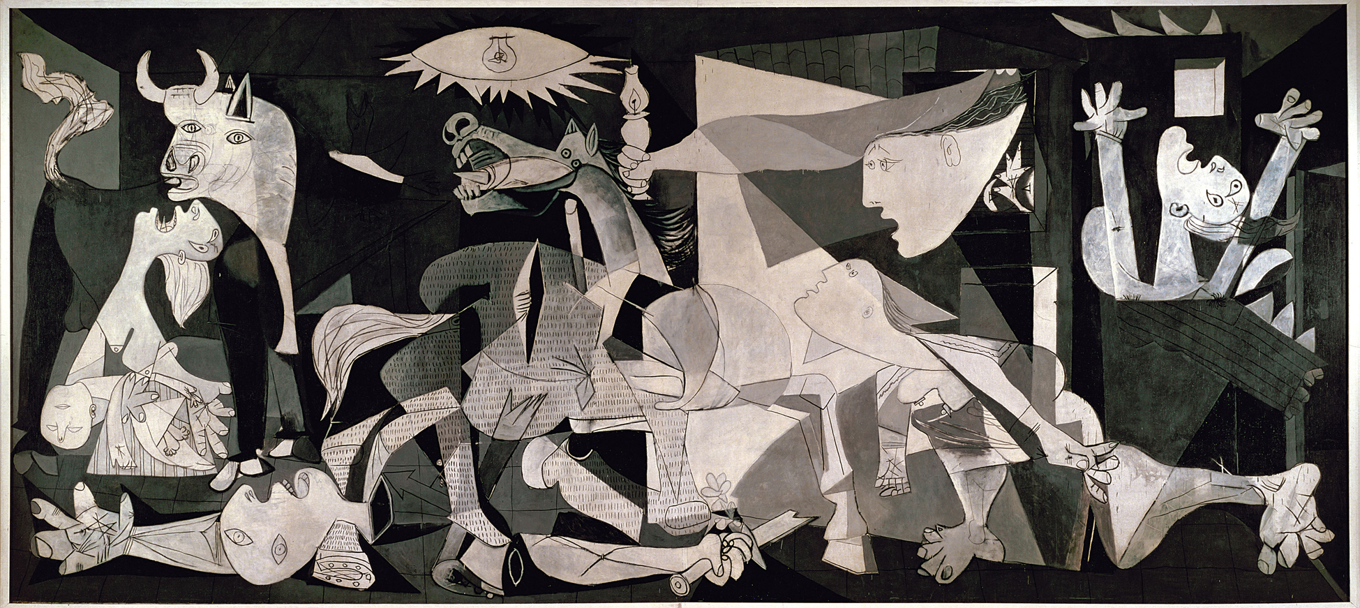
Next on the wall (actually more like in the corner) is the Famille des Lapins, or for those of you challenged by the second language, The Rabbit Family. On a shelf, a toy-stuffed bunny pinned to the shelf, a framed picture of a bloody rabbit skull, a jar of rabbit skulls in a liquid filled jar along, blue rubber gloves pinned to the shelf as well and a pair of tongs at a 45 degree angle leaned against the jar of skulls. Initially my reaction to this piece was the exact opposite of my reaction to Camouflage Armé. I was seduced by the ‘cool factor’ of the skulls in a jar – but upon further reflection it strikes me that this is a rather shallow piece. There’s no note that was inside any of the rabbits, and I’d be hard-pressed to see it as representing lust. Forcing an interpretation to go in only one direction (due to the graphic nature of the picture and the juxtaposition of the skulls in a jar). While there is good art that leaves nothing open to interpretation and basically sledgehammers you with its ideas and opinions (see: Picasso’s Guernica, Borduas’ Étoile noire or Rubens’ Saint George Battles the Dragon) for the most part I prefer art that is open to a variety of interpretations. It kind of gives you something to talk about, think and ponder, instead of being just what it is. And besides I like Hasenpfeffer and Coniglio All’ Ischitana.
Continuing on our tour around the room, Les Chasseurs (The Hunters) is very similar to Camouflage Armé in that it is a painting with most of the canvas covered by a camouflage pattern. In this case there are some fake rifle barrels on the frame and some cartoon-like images of 14 stereotypical hunters at the bottom, again a fairly straightforward painting. Not quite as forceful and in-your-face as Famille des Lapins, I think it could be made better by making the hunters larger and reducing the camouflage to background status. I also find it interesting that Ms. Dubeau decided to use quote, dramatic lighting, unquote for her camouflage paintings. The idea of shining a bright spotlight onto something that is designed to meld into the background is an interesting concept. I’m not certain if it was done intentionally as an awful lot of the exhibitions I’ve seen at the Maison de la Culture Frontenac used quote, dramatic lighting, unquote.
Les Chasseurs by Diane Dubeau
Ms. Dubeau appears to be intrigued by the number three. Or potentially thinks that triptychs are cool, because a bunch of her work is presented in threes. Case in point: Au Pays des Cauchemars,Au Cœur des Cauchemars and Le Trophée des Cauchemars. Three tiny assemblages (not quite paintings, not quite sculpture, not quite collage, not quite…) all made with acrylic paint, a toy moose, pins (although they look more like staples) and something she calls “perles synthétiques” but I would call plastic beads. I couldn’t quite figure out if they went right-to-left or left-to-right as none of them looked all that much like a trophy or a country. I wasn’t as confused by the heart one, but mainly because it was in the middle, not due to any of the iconography.
Au Pays des Cauchemars, Au Cœur des Cauchemars and Le Trophée des Cauchemars by Diane Dubeau
Her fascination with threes continues with La Chute I, II and III. The Rabbit, The Man and The Bird respectively. Either riffing off of Roberto Longo or Kate Puxley (or perhaps both, but then again maybe neither) This is how I think she should have done Les Chasseurs. Or more pointedly, a larger and more central image on a patterned background. Personally I’m not certain how I would interpret a falling rabbit, a falling bird sometimes can be considered a Stymphalian bird (from the sixth labor of Hercules) but that would be a humongous stretch in this case. And there is tons of fodder on and about falling men, if you need help click here. But I’m not quite sure what to make of the bones or the red and black checked backgrounds for the animals (aren’t picnic tablecloths typically red and white?) She also worked on the frames – but her pictures are too small for me to make out what she did to them, and as I previously mentioned I wasn’t allowed to take any pictures.
La Chute I, The Rabbit by Diane Dubeau, photo by Paul LitherlandLa Chute II, The Man by Diane Dubeau, photo by Paul LitherlandLa Chute III, The Bird by Diane Dubeau, photo by Paul Litherland
Next on the wall is Alambic de Creation. But as the cops say, “Nothing to see here, keep moving…”
Which brings us to Les Griffes I, II and III. Subtitled Fausses, Dégriffes, and Piercing (or in the words of squareheads, “fake, declawed and piercing.” I didn’t translate the word “griffes” because it can either mean fingernails, claws or a bunch of other things (including, interestingly, a cut of meat at the front of the shoulder) and my best guess would be that Ms. Dubeau is playing off of that double meaning in this work. Basically three plaster casts of a pair of hands, one would presume Ms. Dubeau’s hands, one pair with a fake set of very red nails, one pair broken off at the intermediate phalanges and the third pair which has those plastic beads (aka “perles synthétiques”) glued to them. What they have to do with hunting, I’m not entirely certain, but the bright red fake nails and plastic beads contrast quite well on the white plaster.
Les Griffes I, Fausses by Diane DubeauLes Griffes II, Dégriffes by Diane DubeauLes Griffes III, Piercing by Diane Dubeau
Tableaux de chasse,William Holman Hunt,hunting paintings whatever you want to call them ,the stuff exhibited by Diane Dubeau ain’t half bad. As a polemic about watching what you eat and how you eat it, it fails. PETA does this sort of stuff all the time – and while they aren’t a local Montreal artist – their tactics are much more effective. Then, if you listen to hunters who hunt to eat (aka folk like Ted Nugent) they are thousands of time more aware of environmental concerns, societal worries, social norms and just about anything else you can think of. As a means to quote, enlighten, unquote the general public about hunting and/or the source of their food Tableaux de chasse also fails, but not because of the content, but because of the container. I would guess that on a good day the Maison de la Culture Frontenac gets maybe 50 people coming in to see an exhibit. The show is up for 45 days, which means that if every day is a good day 2,250 people see the exhibit. Last I heard there were more than 3 million people living in Montreal, 2,250 isn’t even enough to be called a “drop in the bucket” if you’re talking about the general public. While Ted Nugent Spirit of the Wild might not be seen by as many people as the Super Bowl, but I’m fairly certain that more than 2,250 people watch it.
If I start to talk about the quality of Ms, Dubeau’s work there are obviously some pieces that are executed better (Famille des Lapins) than others (Alambic de Creation) and while the majority of the work in the show is painting the work that is most effective is surprisingly, not the paintings. Whether it is the frames with knitted bullets, the plaster cast hands, or the assemblages, they are all executed very well, in a witty fashion that is quite engaging. Don’t get me wrong, there are non-paintings that aren’t executed well (Alambic de Creation) and there are paintings and there are paintings that are very well executed (Chute I) but if you’re going to get into generalizations, better to stick with the non-paintings. And that to me seems to be the biggest problem with the exhibit, it wants to have a focus, but doesn’t. You’re initially lulled into thinking it’s about hunting or food or something and then out of the blue you get some hands clawing at you. You’re initially lulled into thinking it’s an exhibit of paintings and then out of the blue there are a bunch of bones. But Ms. Dubeau definitely has some mulie in her, and I would imagine that her next show will be closer to the aforementioned 15-point antlers.
Diane Dubeau, Tableaux de chasse is at the Maison de la Culture Frontenac, 2550, rue Ontario Est until August 27, 2011. The Maison de la Culture Frontenac is open Tuesday to Thursday from 13h to 19h, and on Friday and Saturday from 13h to 17h.
, Alfred Pellan : Radar de l’aveugle (ou le sixième sens) (Power Corporation), Paul-Émile Borduas : La Nativité (Jeroboam) (Desjardins). Photo courtesy Loto-Québec")
, Arnaud Maggs : Enfants au travail (Giverny Capital), Dominique Blain : Duty Free (Fasken Martineau), Photo courtesy Loto-Quebec")
, Lynne Cohen : Spa (Caisse de dépôt et placement du Québec), Photo courtesy Loto-Quebec")
, Jérôme Fortin : Solitude # 13 (Loto-Québec), Ed Pien : Dream Land (Banque Nationale), Photo courtesy Loto-Quebec")

, Claude Tousignant : Accélérateur chromatique (Hydro-Québec), Photo courtesy Loto-Quebec")
, Gabor Szilazi : Photos, Ile-aux-Coudres (Hydro-Québec), Charles Gagnon : sans titre (Caisse de dépôt et placement du Québec), Photo courtesy Loto-Quebec")
, Jean Paul Riopelle : Beau temps (Banque Nationale), Marc-Aurèle de Foy Suzor Côté : Paysage ( Loto-Québec), Photo courtesy Loto-Québec")

")


 and La Femme au Bois by Diane Dubeau")


